Tuesday, December 13, 2011

Tattoo

I have recently been asked to design a tattoo for a friend. It really is an honor, but also a pressure. Something that will forever be on her body. I've tried to design a tattoo for someone before, but they decided to go in a different direction... so here are some inspiration photos for the design. Whenever I create an artwork I always find as much imagery as possible to look onto. I tend not to copy the composition or anything, but the inspiration is there. I can use my favorite parts of each piece, like the lighting or color. This allows it to be my own, but I can see back to where my thoughts came from.


Monday, November 21, 2011

Watermark

I found a site that showed how to create a watermark style tee.
I am hoping that I can use this technique for a printmaking project. However, I am concerned, if there are raised areas I am not sure if the screen will print on top evenly. I was hoping to write words in glue, stain the paper, then on top print juxtaposed words and images. We will see how the exploration goes.

How to watermark a tee

Thursday, September 29, 2011

Hakone Open Air Museum

Some photos from my trip to Japan this past summer. I loved this piece when I was small enough for it. There is an age restriction though. But i really do love it still.


Blown Ink

Lawrence Yang wrestles with informational abstractions by day and paints by night. Influenced by graffiti art and traditional Chinese painting, he employs ink, marker, and watercolor, as the permanence of this media adds a sense of immediacy to his work. Lawrence's paintings make use of color to communicate atmosphere and emotion, and they are concerned primarily with creating order out of chaos (and vice versa). Lawrence once ate an entire bag of Fun Size Three Musketeers™. He lives in San Francisco with his imaginary pets, Cholo and Binky.


Lawerence Yang's Blog

Friday, September 23, 2011

E+P Accordian Book

Elements +Principles Book:

Student use dry media: pencils, markers, highlighters, pens, crayon, colored pencil

Students choose a single shape. Make three of this shape. This will create unity. In the form of the shape, student will written the word unity.

Student will write the word repetition. Student will repeat this word. Student will repeat at least 10 of the first simple shape.

Student will create the simple shape in variations of sizes or form. Vary the proportions of the sides of the shapes.

Create contrast by making some variations in color or shape. Variety and interest are attained by making variations. Emphasis can be given through contrast.

Write the word emphasis with emphasis on it using color, size and or line.

Write the word movement in a shape that demonstrates movement.

Write the word pattern in some sort of color pattern. Repeat a pattern in color and shapes around this word.

Write texture and experiment with texture inside it. Write the word shape in a shape. Write the word line on a line. Color the word color with colors. Show the word value with values of one color. Give the word space a sense of space. Write the word size with different size letters. Write the word point around a point. Write the word form in a form.

Finish the book with an About the Author page, and two covers.

Thursday, September 22, 2011

Elements and Principles

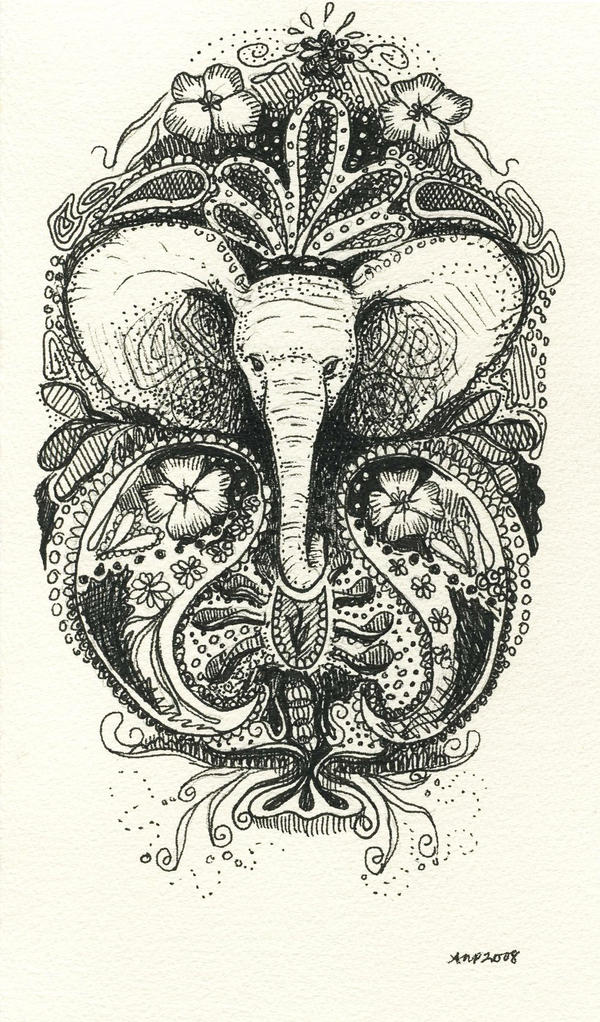
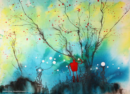
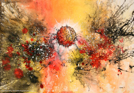
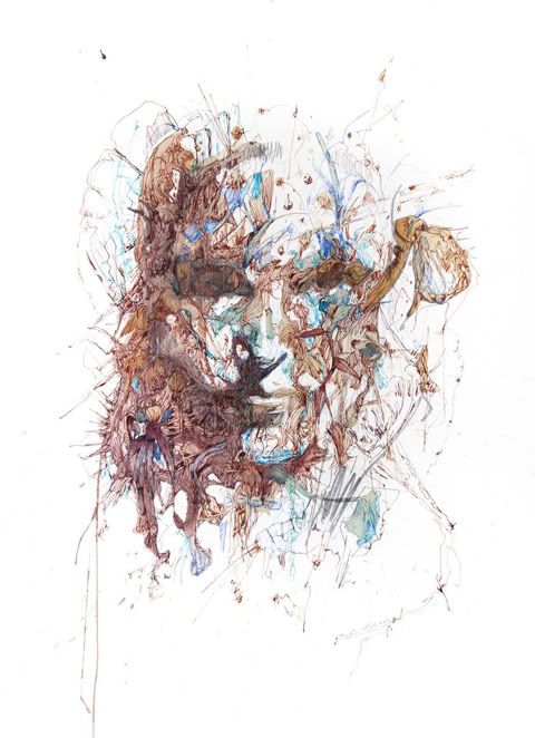
Although many art education teachers are now advising to stay far, far away from the elements and principles. I disagree. I know that some aspiring art teachers and artists might want away with the elements and principles because throughout school they are individually dissected for you. I do firmly believe they are of great importance. So much of art can be broken down in to simple reasons, based on elements and principles, of why a painting works.

Through Mill Street Loft Art Institute Todd Poteet asks his painting students to sit and list every element and principle they can think of. The list normally looks something like this:
Line, Form, Shape, Color- Analogous, Complimentary, Quadrad, Triad, Spilt complimentary, double split complimentary, primary, secondary, tints, shades, monochromatic, neutral, grayscale.
Unity, repetition, movement, space, rhythm, pattern, proportion.
Perspective- 2 point perspective, 3 point perspective, atmospheric perspective, linear perspective
Shadow, highlight, Contrast, variety, emphasis, depth, point, value, texture, size, gradation, harmony, dominance, balance- symmetrical, asymmetrical.

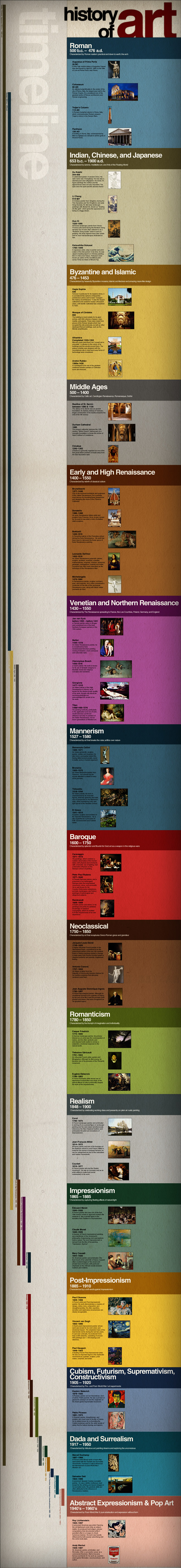
We would list all that we know, Todd would add a few we forgot, and he would go over the Golden Section. He would apply the mathematics of the golden section to paintings such as The Last Supper by Leonardo da Vinci.

Students are able to have a Big Idea as the basis of the lesson plan, but with the elements and principles, a very well constructed composition can be planned out. With this, students are also able to discuss paintings and why they are so visually appealing.


Thursday, September 15, 2011

Relevant Art Education

Throughout high school, class often focus on just doing gray scale, then doing a gray scale still life. Or using impressionistic dots to form a painting of a landscape.

Students need challenges, students need to be able to relate to their art.

At Mill Street Loft in Poughkeepsie, NY, Todd Poteet challenged his students not only to explore their materials and develop skills, but to think for themselves and do projects that the student designs.
Students are given broad ideas or themes to expand upon. Yes, he does make us think out the entire composition first, and discusses why. But, in all it does give more freedom, while also developing skills.

Some classes he even has the students pick their theme for a series. Such as Ksenia's series of keys.

Sunday, September 11, 2011

Homemade Paint

An interesting recipe for homemade finger paints. This will definitely be something I will have to experiment with.

Friday, September 2, 2011

Surrealist Ink Blots

Surrealist games can be used in art production.

From using a process similar to inkblots which have been draw on after the ink has dried. Through the randomness of the inkblots the artist can create images that he/she sees in the chaos.
These artworks are made by Florian Nicolle (aka neo). This artist is a 24 year old graphic designer and illustrator from France.
Nicolle has had clients such as the Los Angeles Times and ESPN classic.

She uses a computer to create these images, programs such as Photoshop and Illustrator allow this.

While stumbling on the internet I was able to find this artist at this web address. If you do go onto this page you can see a step by step instruction on how to create images like this. It is possible to use these instructions for physical painting/drawing, as well as digital.


Florian Nicolle thinks extensively of every choice she makes on top of the blots and splatters. This image of Michael Jackson is created on white splatter with pencil, chinese ink, watercolor ink, details added in photoshop, then finally Billie Jean lyrics incorporated into the forehead of Jackson.


Below is a video time lapse of how another artist creates an image out of ink blots. Again this image was created in Photoshop, however the same process can be created with pen and paper.